Web3 ecosystem startup
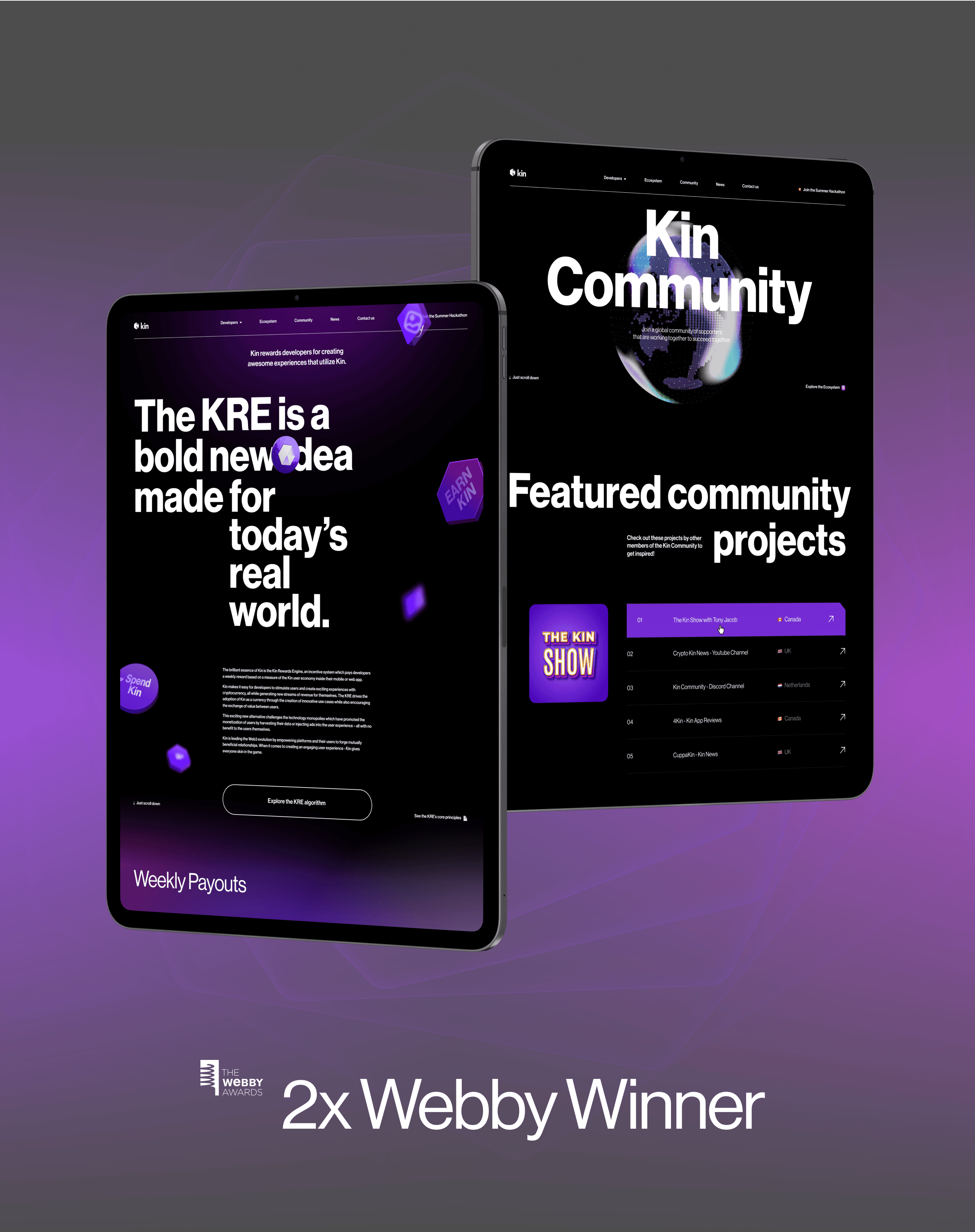
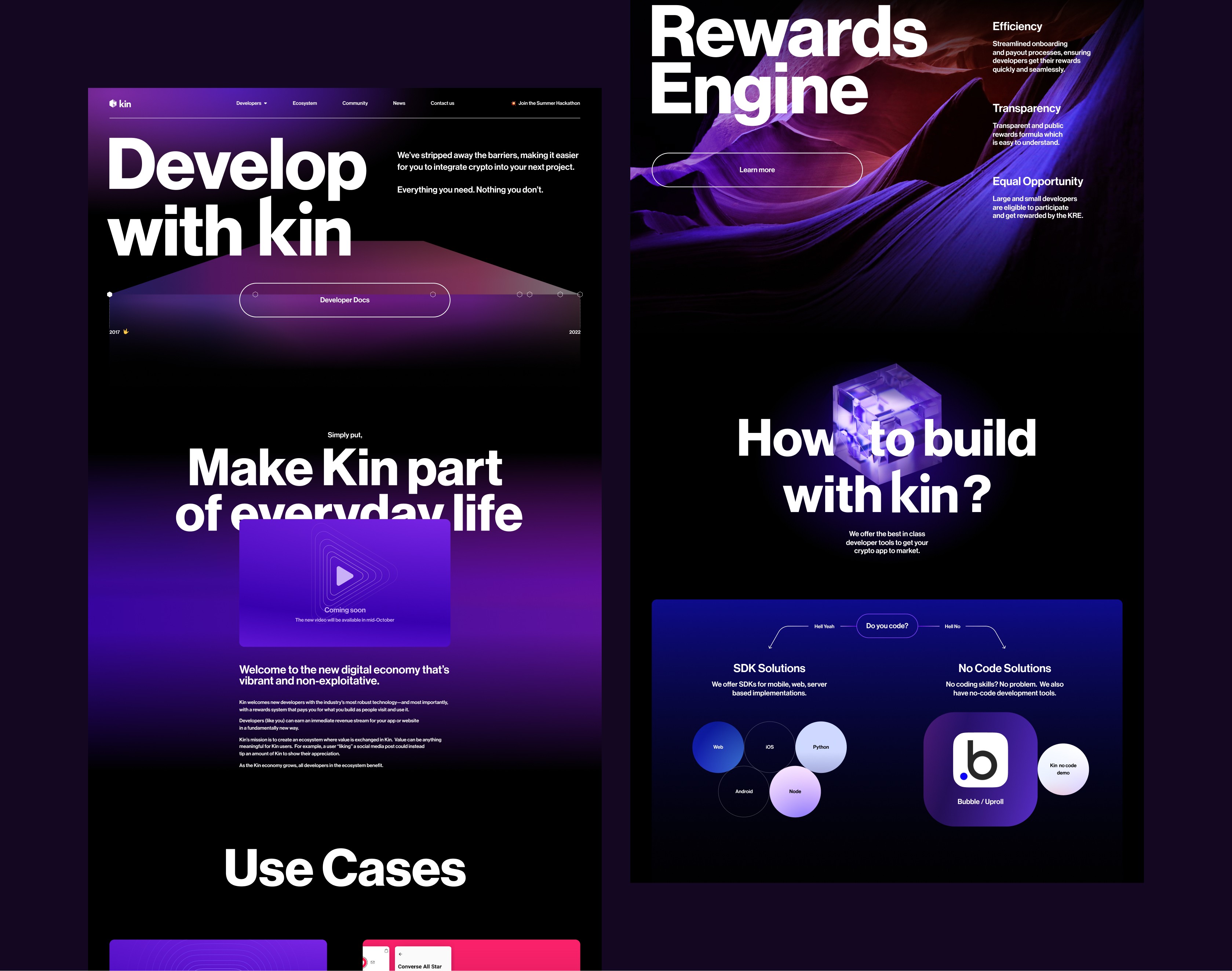
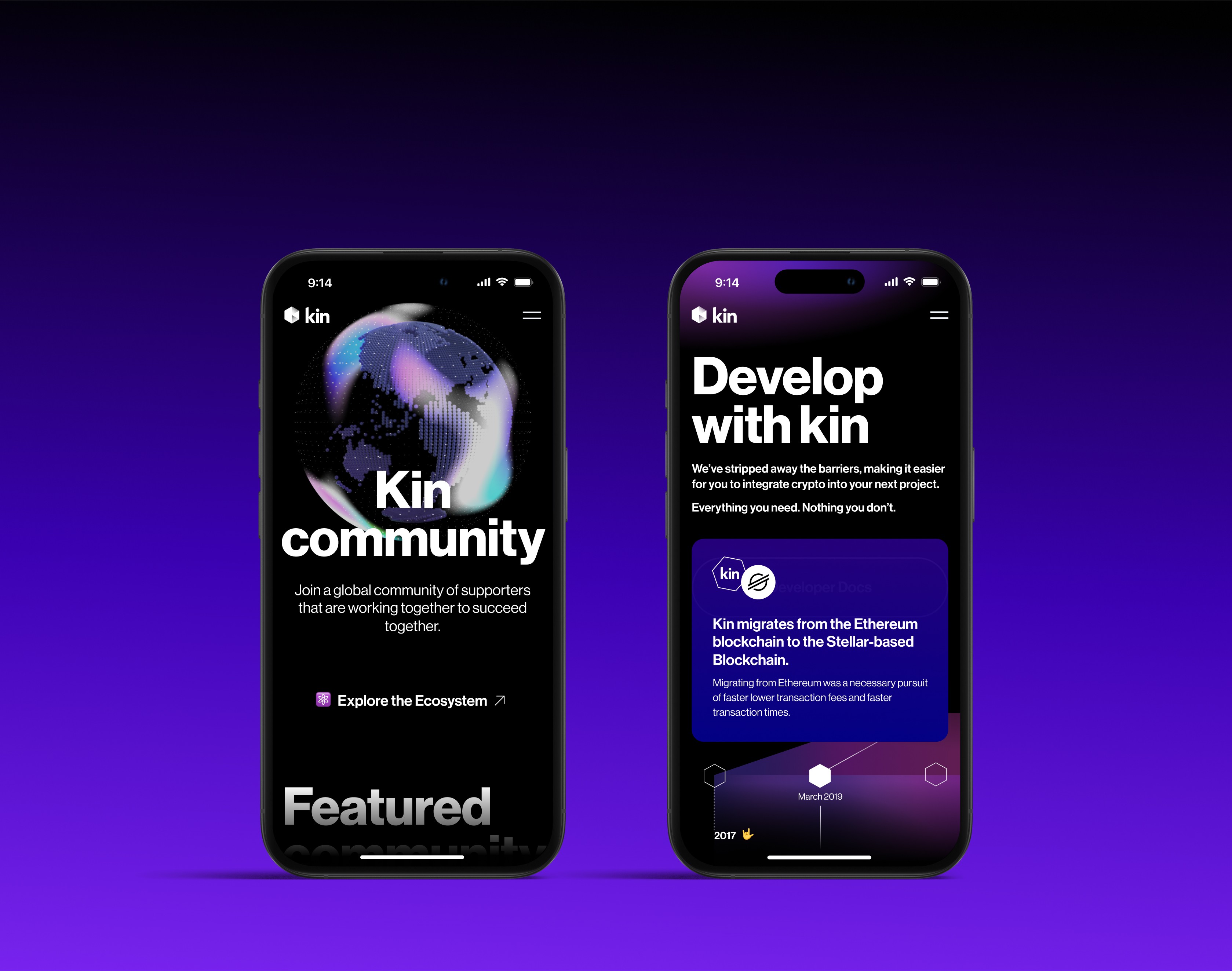
Kin Foundation is a Web3 ecosystem with a huge, active community — and our task was to give it a bold new face online. I was responsible for the concept design, working across all breakpoints to build something that felt fresh, expressive, and easy to navigate, even for people who aren’t deep into crypto. The visual direction is based on simple shapes — circles, squares, hexagons — combined with gradients and subtle 3D elements. These forms reflect the modular, building-block nature of Web3, while also giving a sense of structure and trust. I created responsive layouts for mobile, tablet, and desktop, making sure everything feels smooth and clear no matter the device. The end result is a bright, modern experience that invites people into the Kin ecosystem without overwhelming them.
Year
2023
Role
Concept & Screen Designer
Client
Kin Foundation


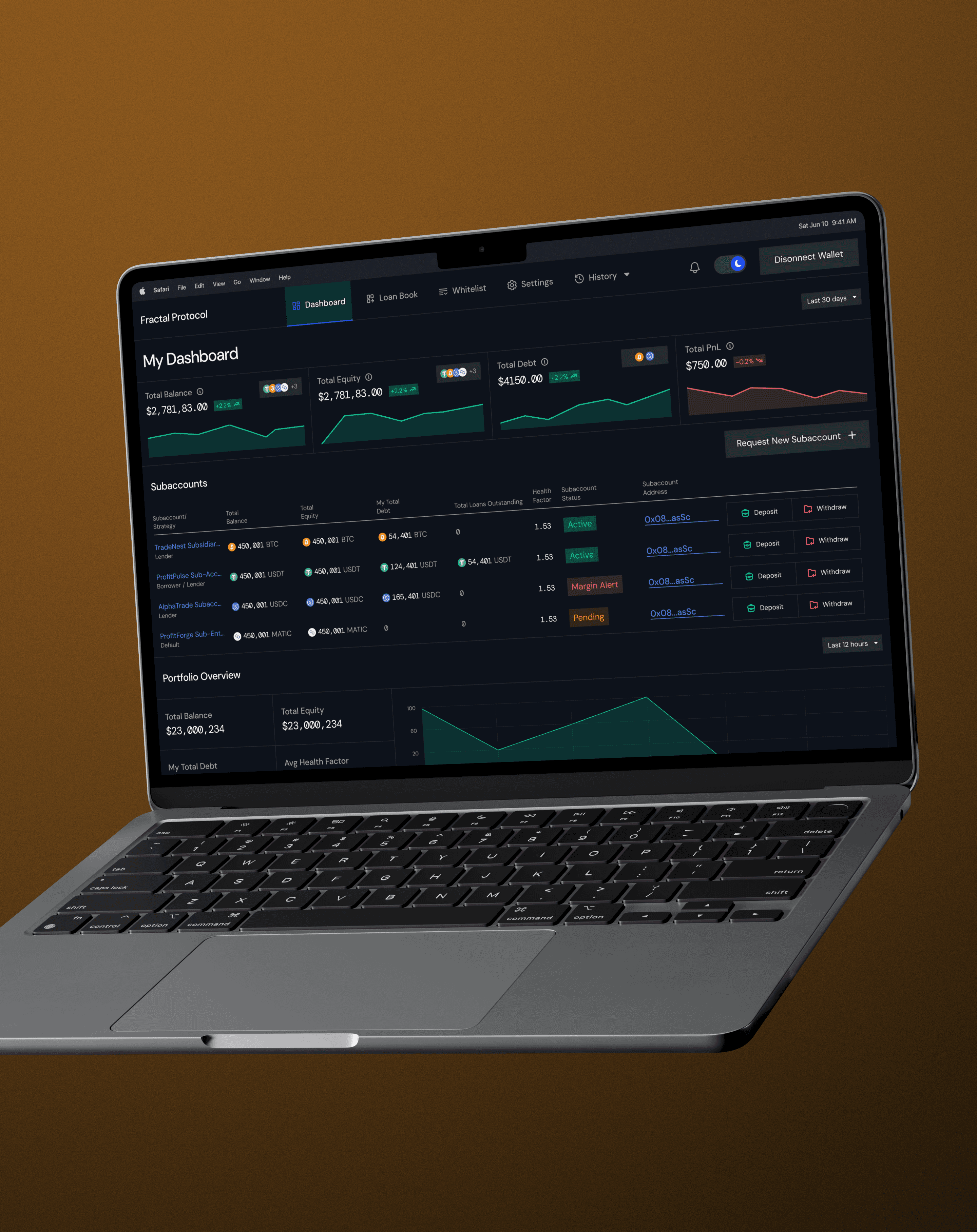
Fractal Protocol is a mature desktop-first platform built around structured data and a loyal user base. My task was to lead a careful redesign of the interface — improving clarity, hierarchy, and overall usability, while preserving the familiarity of the existing product. The goal was not to overhaul the experience, but to enhance it thoughtfully, with minimal disruption. I started with a full UX exploration: wireframes, moodboards, and multiple visual concept iterations to define a visual language that feels modern, focused, and trustworthy. Since the platform is desktop-first, I designed for a wide range of screen resolutions, building a scalable layout system optimized for content-heavy views. To ensure real-world relevance, I planned and prepared user testing sessions — including detailed scenarios and interactive prototypes. The insights gathered helped validate key design decisions and surface adjustments before finalizing UI. The platform was delivered in both light and dark themes, with carefully considered typography, spacing, and interface logic tailored to data-heavy workflows. The result is a visually refined yet unobtrusive design that respects user habits while elevating the overall experience.